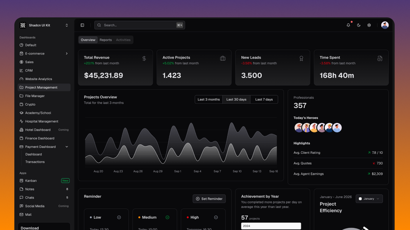
Shadcn UI Kit is a design system and component library offering pre-built admin dashboards, website templates, and UI blocks for React applications built with shadcn/ui and Tailwind CSS.
What is Shadcn UI Kit?
Shadcn UI Kit is a collection of production-ready UI components, templates, and blocks designed for React applications using shadcn/ui and Tailwind CSS. It takes as input developer projects and provides over 225 marketing and eCommerce blocks, 12 admin dashboards, 503 free components, and 60 real-world examples to accelerate development. The kit runs on any React-based framework including Next.js, Vite, Remix, and TanStack Start, and is created by BundUI (bundui.io).
Key Features
- Admin Dashboards — 12 production-ready dashboards (CRM, eCommerce, Project Management, Finance, etc.) with 70+ pages and both light/dark mode.
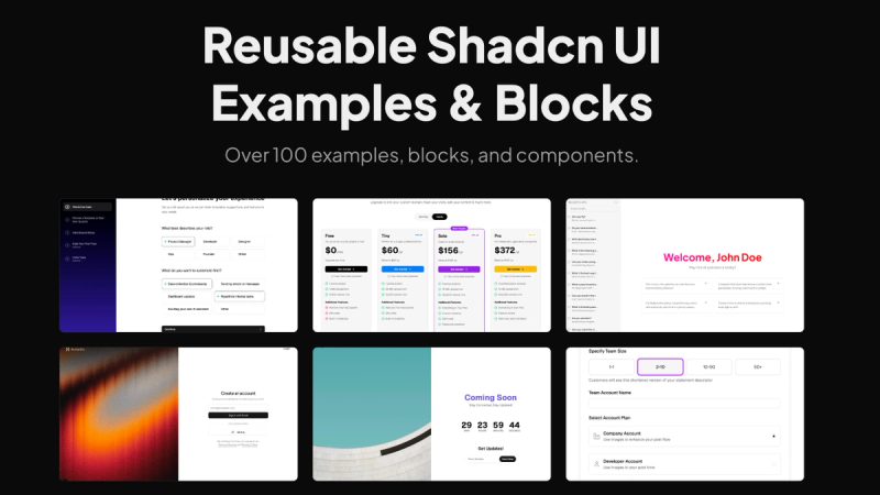
- UI Blocks — 225 pre-built blocks for marketing (hero sections, CTAs, pricing tables, testimonials, etc.) and eCommerce (checkout, product list, product details).
- Free Components — 503 extra shadcn/ui components beyond the base library, available for copy-paste or CLI installation.
- Theme Generator — Visual tool to customize colors, typography, radius, and spacing; exports CSS variables for direct integration.
- Animated Illustrations — Growing collection of animated bento cards and motion effects built with Motion and Tailwind CSS.
- Website Templates — Three premium templates: Neofolio (portfolio), Soho (chat app), and Cosmic (SaaS landing page).
- Framework Compatibility — Works with Next.js, Vite, Remix, TanStack Start, and any React project supporting Tailwind CSS.
Who is it for?
- Developers building admin dashboards — use the 12 pre-built dashboards and 70+ pages to quickly set up analytics, CRM, finance, or project management interfaces.
- Designers and frontend engineers creating marketing sites — leverage the 225 marketing blocks (hero, features, testimonials, pricing) to assemble landing pages without custom CSS.
- Startups building MVPs — combine the website templates (portfolio, chat, SaaS) with blocks to launch production-ready applications faster.
What can you do with Shadcn UI Kit?
- Build a complete admin panel — choose from dashboards like CRM, eCommerce, or Finance, customize with the theme generator, and deploy with React.
- Create a marketing website — mix and match hero sections, CTAs, feature sections, and testimonials blocks to design a landing page.
- Prototype a chat app — start with the Soho template, which includes chat list and messages UI.
- Generate a custom theme — use the Theme Generator to adjust colors, font, radius, and export CSS variables for your project.
How does it work?
You can install components via CLI (npm/yarn/pnpm) or copy-paste the code. Blocks and templates are provided as React components that you can drop into your project. The theme generator outputs CSS variables that override the default shadcn/ui theme.
Pros and cons
- Pros: Large library of blocks and components (225+ blocks, 503 components); extensive admin dashboard collection (12 themes); visual theme generator for quick customization; compatible with multiple React frameworks.
- Cons: Requires existing shadcn/ui and Tailwind CSS setup; premium pricing for full access (freemium model with some free components).
Pricing
Freemium model with a paid tier for full access to all dashboards, templates, and blocks. “Get All Access” link points to pricing page at shadcnuikit.com.
Alternatives
- shadcn/ui — the base design system (free, open-source) which focuses on primitive components rather than pre-built dashboards and blocks.
- Tailwind UI — component library by Tailwind Labs, offers similar blocks and templates but does not include admin dashboards.
FAQ
Is Shadcn UI Kit free?
Some components (503 free components) are available for free, but full access to admin dashboards, premium templates, and all 225 blocks requires a paid license.
What frameworks are supported?
The kit works with any React framework that supports Tailwind CSS, including Next.js, Vite, Remix, and TanStack Start.
How do I install components?
Components can be installed via the Shadcn CLI (e.g., npx shadcn-ui@latest add) or by copying the source code directly.
Does the kit include light and dark mode?
Yes, all dashboards and blocks are available in both light and dark themes.
Can I customize colors and typography?
Yes, the built-in Theme Generator lets you visually customize colors, typography, radius, and spacing, then export the CSS variables.
Visit the official site at shadcnuikit.com for demos and pricing. Source code and updates are available on GitHub. The product is developed by BundUI (bundui.io).